
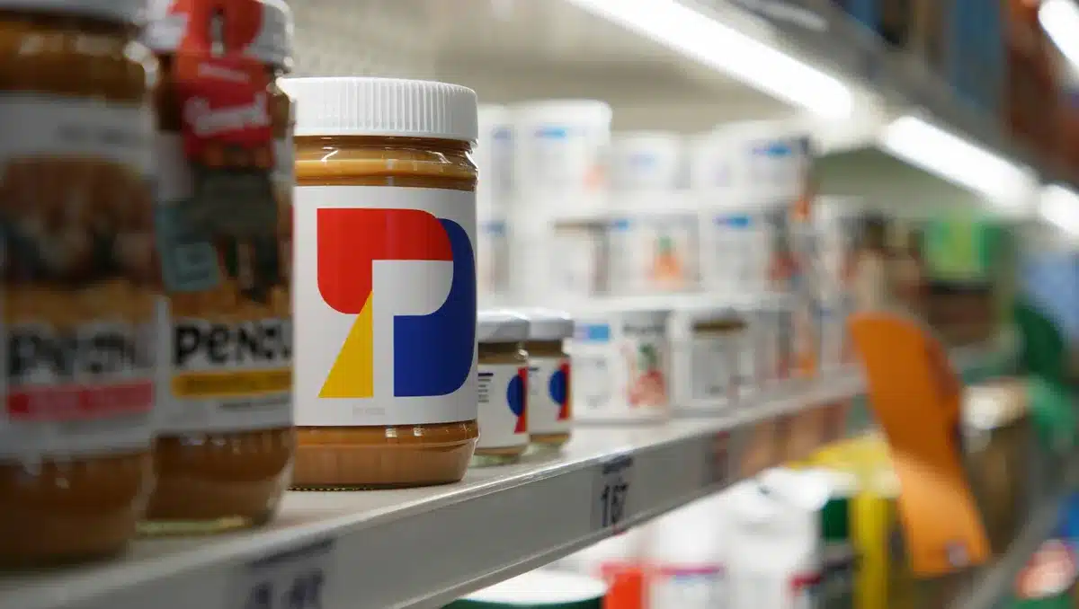
Jif peanut butter is undergoing its first major brand refresh in more than 30 years, unveiling a modernized logo and reimagined packaging designed to position the product beyond the traditional peanut butter and jelly sandwich. The J.M. Smucker Co. announced the transformation on August 10, 2026, with new branding that revives the brand’s iconic red, blue, and green tri-color banner while removing the dated drop shadow from the letters for a cleaner, bolder visual identity.
The redesign reflects a strategic shift in how Jif wants consumers to think about the product. Currently, Jif peanut butter appears in just 4 percent of total snacking occasions, despite 85 percent of consumers recognizing the brand’s distinctive tri-color logo. Most associate the brand primarily with sandwiches, leaving significant untapped potential across other eating moments throughout the day.
The new packaging showcases multiple ways to enjoy Jif—from dips and smoothies to protein bowls and pasta dishes—keeping snack inspiration front and center. The refresh also includes product-line updates: Jif To Go is being renamed Jif Dippers to more clearly communicate the snackable dipping occasion and portability. Squeezable formats and flavored spreads like Jif Peanut Butter & Chocolate also underscore the brand’s commitment to consumer-led innovation.
Shelly Kowal, marketing director at The J.M. Smucker Co., said in a statement that the company “approached it with real intention” to honor the iconic elements consumers know while bringing new energy to retail shelves. “Jif has evolved from being one of the key ingredients in a PB&J to also serving as a delicious complement to so many snacking occasions, and this new branding celebrates that.”
The “Every Jif’ing Thing” Campaign
Alongside the visual refresh, Jif is launching a multimedia campaign developed by PSOne (Publicis’ solution for J.M. Smucker) with creative led by BBH USA. The campaign, titled “Every Jif’ing Thing,” reimagines the brand’s three-letter logo as a vehicle for different snacking occasions, transforming it into actions like “dip,” “sip,” and “mix.”
A 60-second hero spot sets these snacking scenarios to a remixed version of Carl Orff’s classical epic “O Fortuna,” one of the most recognizable pieces of classical music ever recorded. The creative spans broadcast, streaming, online video, Meta, TikTok, and Pinterest, with additional work from Zenith on media and paid social, Digitas on social creative, and Saatchi X on commerce.
Yohan Daver, executive creative director at BBH USA, noted that Jif’s logo is so recognizable that changing it “felt almost forbidden, which is exactly what made the idea fun.” The campaign demonstrates the brand’s versatility while tapping into consumer awareness that already runs deep.
Products featuring the new packaging and branding will begin shipping in October 2026 and transition to store shelves in waves throughout the fall and early winter. The product itself remains unchanged—the refresh is purely a visual and strategic repositioning aimed at expanding Jif’s presence in the modern snacking landscape.
Sources
- PRNewswire — Jif’s official announcement of the brand refresh, timeline, and strategic rationale
- Marketing Dive — Campaign details, the 4 percent snacking occasions statistic, and creative strategy
- Packaging Strategies — Logo redesign specifics, drop shadow removal, and packaging imagery changes